Theming basics in Android
Theming the app could be one of the most confusing topics in Android development. It is getting harder to maintain the styles of your components and theming of your app while the project is getting bigger. If you don’t have a good design system, you might have inconsistent designs and colors in the app. Having a good understanding of styling & theming will help you create UIs consistent across the app. Also if you are thinking about migrating to Compose, a poor design system might create more complexity.
Having a good design system requires to have a proper styling & theming setup. This helps us to have consistent and reusable styles for our components. But how do we actually have a proper styling & theming setup?
Well, this question does not have only one answer but it can be divided into 5 pieces.
- Attributes
- Default style
- Style vs Theme
- Theme overlay
- TextAppearance
Attributes
Everything starts with an attribute. Without attributes, nothing in XML would have any characteristic that we can define. Attributes are named values that have their definition in attrs.xml file. An attribute can be defined for a view as well as a theme. For instance, android:layout_width attribute is a view attribute whereas colorPrimary is a theme attribute.
A view attribute is set in the view’s XML either by setting directly on the view tag or indirectly by using style(will be mentioned later). Let’s look at how we can set the background of a button to red with android:backgroundTint view attribute.
Note: In order to access the built-in attributes,
androidprefix is used.
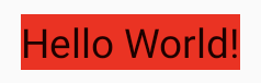
Let’s say you want to change its background to white. You can do this by setting the android:backgroundTint attribute to white.
This is fine if you will only change a single button. But what about if you would like to change all the red buttons to white? It can be achieved by:
- Using a theme attribute for
android:backgroundTint - Creating and applying a style to all buttons
A theme attribute is an attribute that does not belong to any view and can be changed at the theme level.
In order to use a theme attribute for android:backgroundTint, let's first define a custom theme attribute called myButtonBackground in attrs.xml.
An attribute’s type is set with format field. The format can be given as a single type or multiple, for example with android:background format="reference|color" which accepts both references to a drawable resource (“reference”) and color (“color”).
You can now use myButtonBackground attribute to set your button's background. But before that, you need to set a value to myButtonBackground. It must be defined either in the theme or the theme overlay that’s going to be used.
Then you can use this attribute to set the background of your buttons.
If you change the attribute value, then the background of all buttons using ?attr/myButtonBackground attribute as its background will change. Alternatively, you can use ?myButtonBackground as a short hand instead of ?attr/myButtonBackground.
But setting android:backgroundTint to myButtonBackground for all buttons might be overwhelming. In order to overcome this, we will be creating a style and applying it to all buttons using a default style.
Default style
Have you ever noticed that even if you don't give any background to the button, you get a background drawable? This is because the Button component has a default style as any other view. A default style is a style that is used as a view’s base style.
Let's check the button's default style.
Button’s default style is set through R.attr.buttonStyle theme attribute. So it means that you can change the default style of all buttons in your app with this attribute.
Let’s change the default style of the button in our theme so that the background will be red.
Then whenever you create a button, you will get this.
Isn’t this more like a text with a red background? This is because MyButton style does not inherit from any styles. For this reason, all buttons will only contain the background attribute in their default style. Let’s check how the default button style looks like in AppCompat.
As you can see, these attributes are the base style for the button. Let’s give Widget.AppCompat.Button as a parent to the MyButton style and change the background attribute with backgroundTint since we only want to change the color not the drawable.
Then we get a button with a red background 🎉.

Style vs Theme
We have mentioned both style and theme but what is the difference between them? Both style and theme are set of attributes but the difference is what they apply to. Styles are meant to be applied to views and themes to an activity or entire app. Because of this reason, a style should only contain view attributes and a theme should only contain theme attributes.
You can change the style of a view in 3 ways:
- Changing the view attribute on the layout file
- Creating a new style and applying it with views
styleattribute on the layout file - Specifying a default style
Let’s see how we can change the background of a button in the layout file.
Now let’s check how we can create a style and apply it to this button.
Applying a style only takes the view attributes into an account. If you try to set any theme attribute inside MyButton style, it will not work. In order to give an example, we will:
- Use
colorPrimarytheme attribute inside background drawable of the button - Change the value of
colorPrimaryinside theMyButtonstyle
Then even though we set the primary color as red, we get a button with a purple background.

This is because a view only knows about its own attributes; Button isn’t aware of the colorPrimary attribute so it’s ignored.
A view gets the view attributes from the layout file or the style attribute. If a view style includes a theme attribute, it will be ignored.
Then, how do we actually change the theme attributes only for a single view? Here is where theme overlay comes into play.
Theme Overlay
Theme overlay is a technique used to override theme attributes for any view or view group. Theme overlays are very useful when you update the theme of a specific part of your app.
Applying a theme overlay consists of 2 steps:
- Create a style that consists of theme attributes desired to be changed
- Apply this style on the layout file by using
android:themeor programmatically by usingContextThemeWrapper
Let’s continue with the aforementioned scenario where we are changing the button background color by the colorPrimary theme attribute. First, we need to create a style for a theme overlay where we set colorPrimary.
A theme overlay does not have any parent.
Furthermore, it is better to start naming the style with ThemeOverlay since it will make it easier to distinguish from the other styles. This naming technique is used in Material Components and AppCompat too.
Let’s apply this overlay to a button in the layout file.
Bear in mind that if a theme overlay is applied to a view group, it will apply to all of its descendants too. In other words, the theme of every view group’s descendant is overlaid when a theme overlay is applied to a view group.
We can also apply a theme overlay programmatically wrapping the context of the view with ContextThemeWrapper.
ContextThemeWrappercreates a new context (wrapping the given one) with its own theme.
TextAppearance
TextAppearance is a class that contains data for only styling the TextView`s text-related attributes (For instance textColor, textSize but not view related attributes like maxLines or drawableTop etc.).
TextAppearance is set by android:textAppearance attribute on the TextView. android:textAppearance attribute works the same with style attribute. The main difference is the precedence order of them. style takes precedence over android:textAppearance meaning that style will always override the common attributes.
You might be asking why do we need it since we can give everything in style? The answer is having a way to set only text-related attributes makes it reusable for all TextViews whilst leaving the style attribute free.
For instance, let’s create a text appearance for a header.
Now, you can use this text appearance to make any TextView a header.
As you can see, the style attribute for TextView is free and can be used to customize other view attributes. You can also set android:textAppearance by creating a style.
Let’s create a single-line header style.
You can now set this style using style attribute and reuse this style for any text.
If you want to dive deep into text appearances and the precedence of styles more, I highly recommend you to read this article.
Conclusion
Attributes are a key concept in styling & theming. Use view attributes to style a view and theme attributes for the application, Activity, or view hierarchy. If you want to change the style for all instances of a given view type throughout the app, default styles are the way to go. Theme overlays are used to override the theme attributes and you can even use them for views in a given view hierarchy. Text appearances can help you to shape your TextViews text-related attributes with android:textAppearance, while leaving style attribute free.
Thanks Ataul Munim and Nick Butcher for the reviews.

